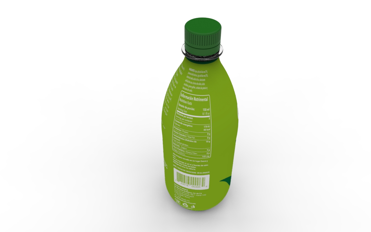
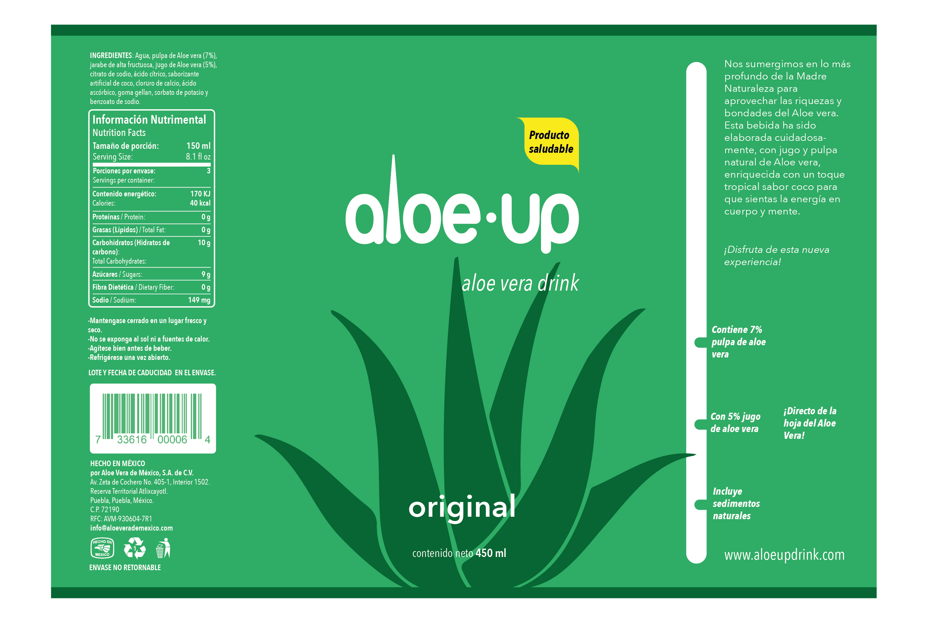
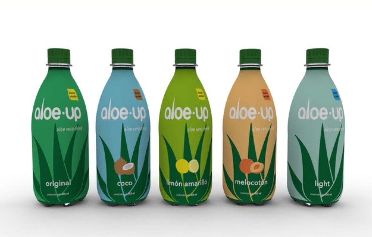
Aloe-up is an aloe drink brand name. The brand identity was designed and then applied to a label for the drink’s packaging.
The idea of the logo comes from subtly using the shape of an aloe leave in the letter “l” of the brand, the rest of the letters should be neutral so, together, they form an integrated element.
For the packaging, each color from the chromatic palette refers to each one of the drink’s flavors. Simple elements were used to give the right information and to integrate with the previously defined identity.
 packaging perspective view.
 label design.
