During the last days I have been exploring the new beta feature of Figma, ‘Interactive Components’. This feature is a great tool for the product designers, it offers new advantages and possibilities. In this post I show some of the explorations I have been doing, mostly on micro-interactions.
First, here’s what I think…
This feature may not be totally new on the product design software environment. I have already used a very similar feature some months ago in other apps like XD. However, it is true that at this moment Figma is The Tool. Adding this feature makes it even more cool. From my experience using this in other applications, this beta seems like a great implementation. The interactive components, together with the variants, the powerful auto-layout and the multi-player, place Figma in a better position.
Having the interactions saved on a design library makes it easier to create more realistic and more complete prototypes. This is a great asset for the initial design research and pre-MVP testing. As this area becomes more advanced, some people mention that soon we will be creating MVP’s directly from Figma. I think that this might be true someday, but at this moment achieving the cleanliness and scalability of the code feels far away.
In the field of the design systems, this tool will make easier to design the micro-interaction and motion of the different components and screens. In terms of documentation, it will also help to communicate this information with the development teams. The scalability and parametrization of the UI kits will also be a great advantage.
_
The explorations
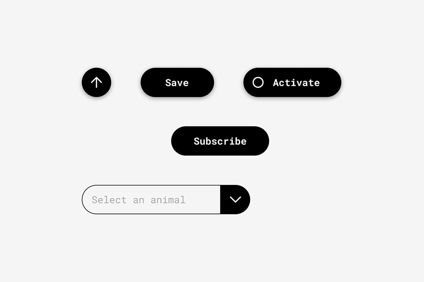
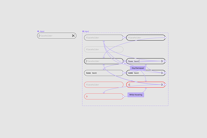
1. Input field : I started playing with a simple input field, defining its different states and micro-interactions. One nice thing about this, is that when you create instances of the component you just have to edit the text once, not in each variant.
 Input field interactions
 Input field interactions
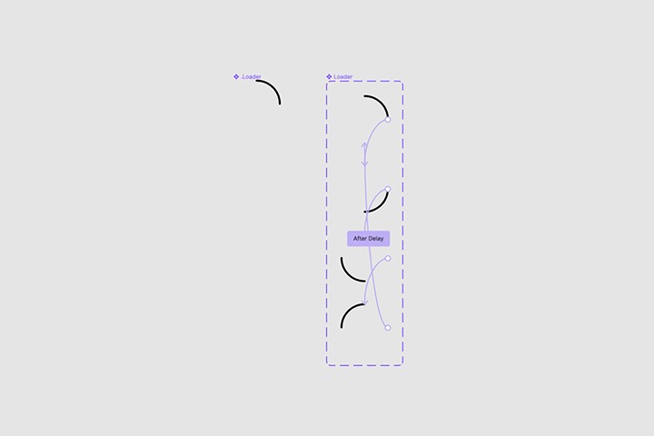
2. Loader: this is a simple loader component that loops indefinitely. This is an example of how the motions could be created directly with Figma and included in the design system documentation. These kind of animations could be then replicated with svg/css animations.
 Loader interactions
 Loader prototype
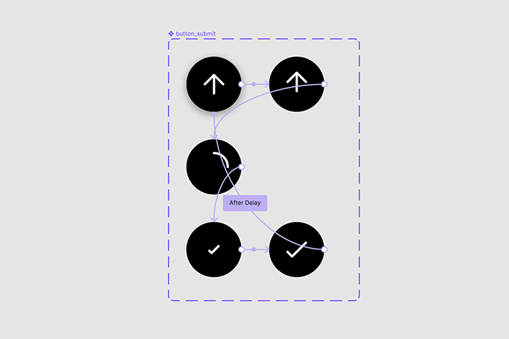
3. Upload button : playing with the micro-interactions of an icon button. The interesting part about this one is that it is re-using the loader as a nested component (amazing Figma!)
 Upload button interactions
 Upload button prototype
4. Save button : this interaction alternates between the use of text and icons.
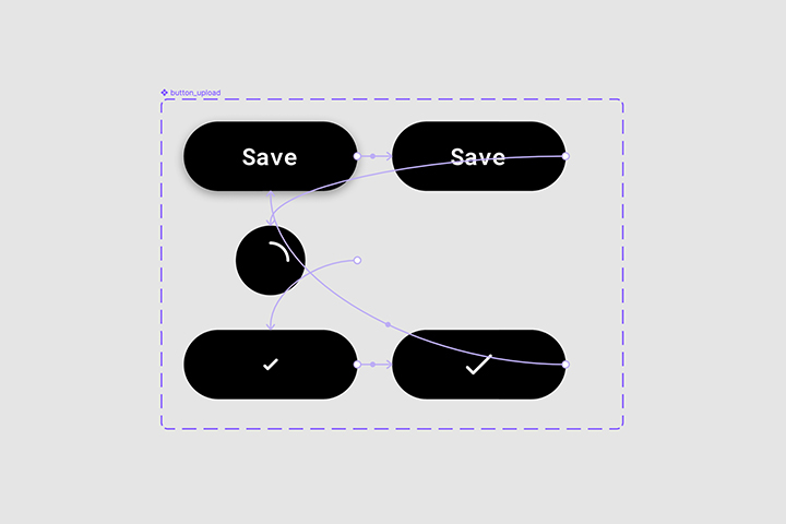 save button field interactions
 save button field prototype
5. Activate button : now playing with icons and text simultaneously.
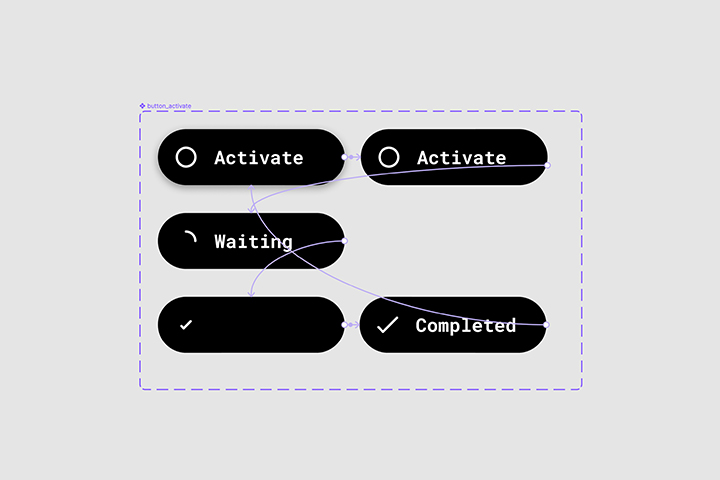 Activate button field interactions
 Activate button field prototype
6. Dropdown : this micro-interactions can be defined at a library level and then re-used along the different flows and wireframes (I haven’t already explored this on a project).
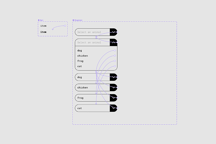 Dropdown interactions
 Dropdown interactions
7. Subscribe component : this is an exploration that combines interactions from the previous components. Having input fields on the prototypes, where you could actually type, it’s a desired feature. I used a hack here, not exactly the most efficient solution. Something in the roadmap about this feature Figma?
 Subscribe button prototype
_
I always try to remind myself that tools are just tools. Designers should be able to create with whatever they have. But having this tool is really helpful and makes things funnier and easier. Thanks Figma!
_
Also published on bootcamp.uxdesign.cc