This is less probable to happen, but I hope that Guido van Rossum never reads this text. I’m sure that the less important thing for him when he created his blog, was the opinion of a designer about the aesthetics. Don’t misunderstand me, this text is about what I learned from visiting the personal blog of the Python’s creator. I’m a ux-ui designer and also a coding enthusiast, of course far for being any kind of professional developer, but I understand the basics. I admire not just Guido but a lot of code creators.
You can check Guido’s blog here.
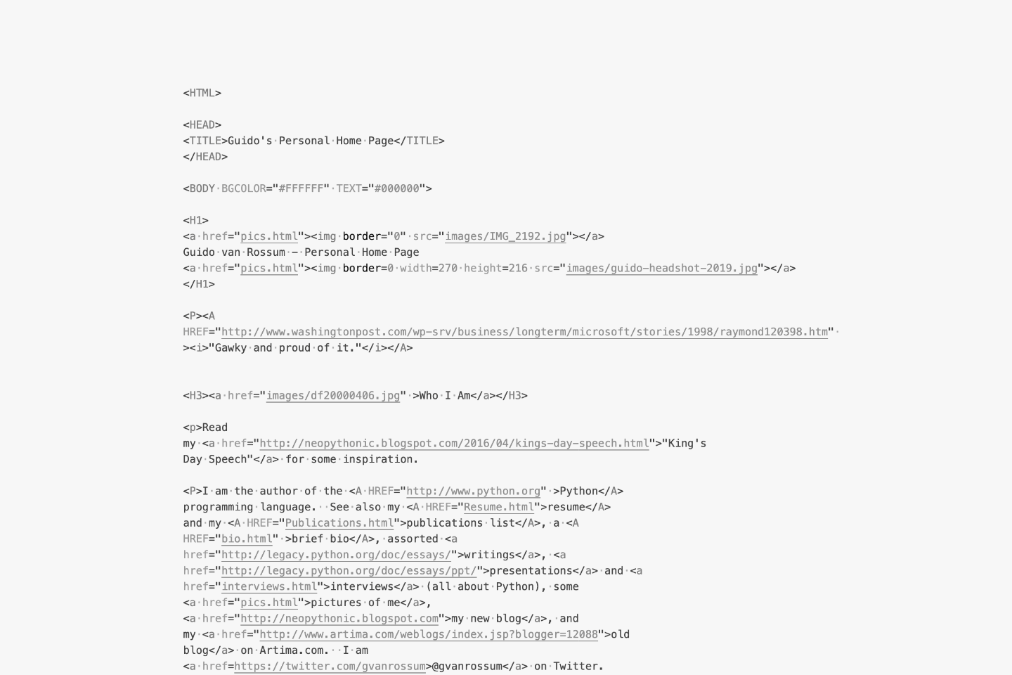
This is the story. Some weeks ago, I was in the office, those times when the offices used to be a place where people go. I was talking with this back-end guy. When I said “back-end-guy”, I mean a dude that after 3 months in the office, noticed that his screen was showing the colors in a different tone. I couldn’t realized that was usable, but for him was not big deal (probably he still uses that same screen). Anyway, we were talking about some html stuff. He showed me the non-conventional Guido’s personal blog. I was waiting for the css to load, but nothing happened. I took a look at the page source, it was like returning to my firsts basic lessons of html in the school. During the rest of the day I kept thinking about this.
Guido’s webpage is almost a perfect exercise of what html was conceived for. No added style, no colors, no scripts, just the html nodes with the correct usage of the tags and canonical order. The main purpose of his blog, that is communicating who is Guido van Rossum, is achieved. I realized that the internet was totally that style during its early beginnings. I’m not sure if Guido was trying to do a statement with his blog. Probably he doesn’t care about the form at all, a little bit as my friend with the colors of his screen.
Let me be clear, the user-centered computing is an important step in the technological culture in which we live nowadays. It allowed the computers to connect with all the users out there through everyday objects. There are incredible interfaces around the world. There are amazing operational systems, great apps and also incredible webpages.
At what point the user interfaces become excessive? There are a lot of examples, where unnecessarily, the code becomes a mess. The initial requirements of the ux or ui established that the solution was in that direction. I mean, my role is to advocate for the users, if they have certain problem, finding the solution must be my north star. There’s also a middle ground. What if we can find also functionality and beauty with clean and simple code?
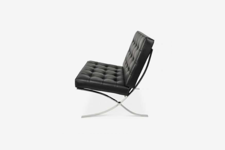 The Barcelona chair by Mies van der Rohe and Lilly Reich
Probably if once you have been interested in design, you have heard about the Bauhaus school. It was a design institute, some decades ago, considered a breaking-point in the history of industrial design. Many great products were created during those years. For many contemporary designers the Bauhaus ideas are obsolete. One of its fundamental principles was The form follows the function. The function was a tricky concept in those days. It mainly referred to the simplification of the object and to the optimization in the manufacture process. Many Bauhaus students were experts in those topics. This resulted in pieces of furniture with a perfect balance of geometry, materials, manufacture, and assemble. Not always the most comfortable and user-centered objects.
Many design movements came after Bauhaus, some of them redefined the concept of function and advocate for the user. One important principle that transcends from the movement was: “Less is more”, as Mies van Rohe coined.
I related this excerpt from the design history, with my approach to Guido van Rossum blog. Sometimes as product designers we forget about our materials and manufacture processes, the code in this case. It’s true that great products have to start with the user requirements, but they also have to consider the overall project. This include among other things, clean architectures, optimal business logics and simple code.
Most of the time, crazy transitions and animations with complex scripts in the back, don’t really make the difference in a product. They do not improve the usability or help with the marketing. You don’t have to take your designs as far as Guido, but sometimes the user will be satisfied with a clean and intuitive interface that runs very fast.
So let’s stop being so complex and start being more Guido…