Branding for musgo things. I was looking for simple ways to help distinguish the brand without being invasive with the information that would be shown. The logo would be an extension of the typography, used for all the brand’s communication.
I chose to use the letter ‘m’, the first letter of the brand name in bold, so it contrasts with the light text used.
The selection of the font and its application are two key factors in the general identity of the brand. The blank spaces and margins are also an important part, they help to visually divide the different sections and blocks.
The main color is black, it contrasts with the white background. In addition to these colors, a very light gray is used in the contents. The images and illustrations used in the content are the ones in charge of adding color.
The general identity have “the less is better” approach, the decorations are practically null.
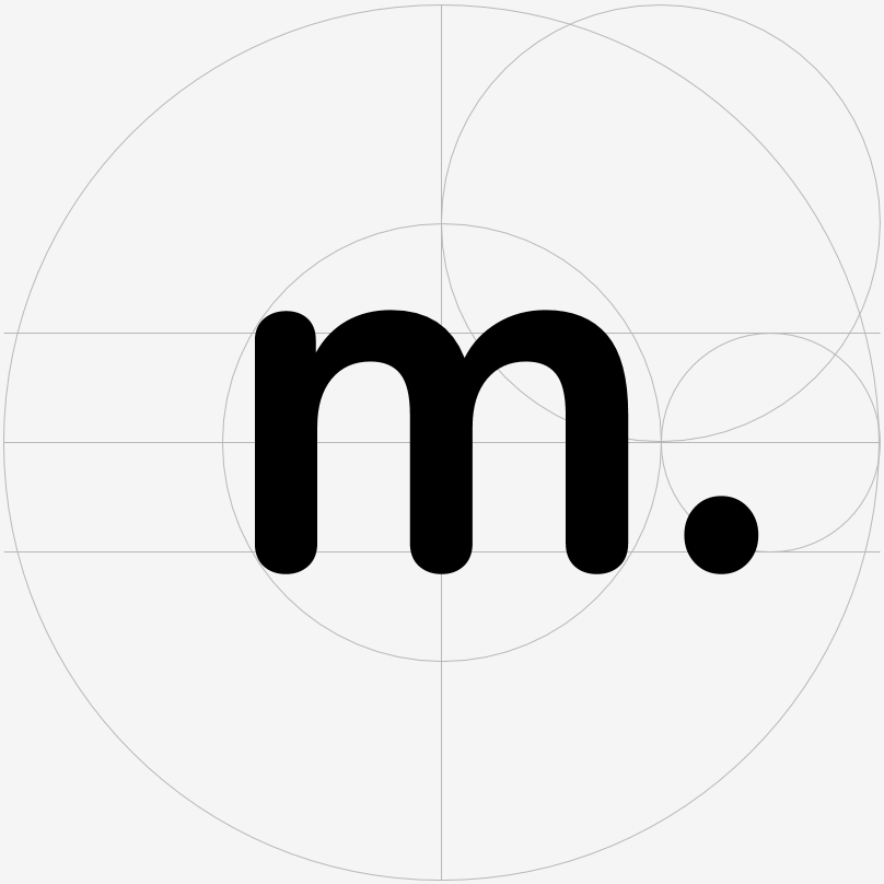
Probably one of the most important element of all the branding is the grid, an invisible object but at the same time a very powerful visual tool.
 logo inside a circle.
 visit cards.
