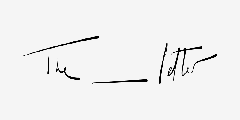
The blank letter, in a poetic way is precisely what the brand seeks to create: a digital universe where women can express their ideas, opinions and recommendations. It’s an empty letter in which all will be writing their words.
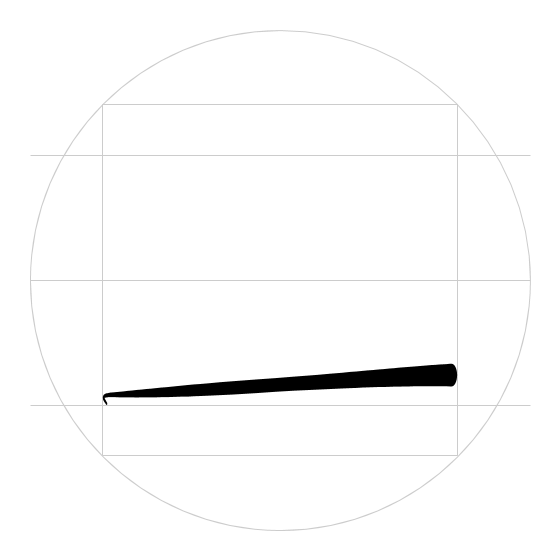
Formally, the logo plays with handwritten typography, with its respective irregularities and deformations, but all within a geometric grid that gives it unity. It is a black line that flows, with the strength and subtlety that the brand wants to represent.
The line is very important, as it represents the empty space and replaces the word blank. It’s also used as the icon of the mark.
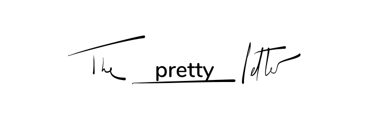
The main logo is also used as the secondary logo of each one of the sections of the digital magazine, filling this blank space with the name of the category.
A color palette was also determined to represent each one of the categories.
With respect to the general identity of the different channels of the brand, we looked for this coherence to create a blank or empty space that would be filled with the different contents. “Content is king”.
 grid.
grid.
 logo variation.
