The blank letter site embodies the foundations of the previously defined graphic identity. The site is based on 3 fundaments:
- Application of the brand.
- Usability (digital magazine).
- Clean and flexible coding.
The design of this site was a process that began by studying the needs of the brand and future users, the fundamental question was: What do people and future users need in a digital magazine?
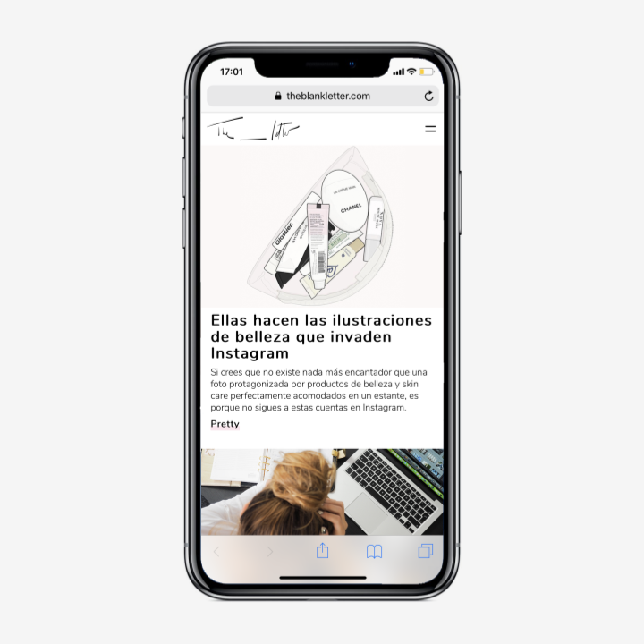
Regarding the function of the magazine, its design was inspired by the functionality of apps, to show content by scrolling on the screen, the idea is to have a constant flow of content.
The design should be strong enough to show the brand identity, but also clean and versatile enough to fit any image or content that will be used in the magazine.
We worked on a very intuitive navigation that will help you get to the content you want. On the other hand, we worked a lot on the organization of the content. A color palette was chosen to define each category and help the person know where they are on the site.
Within the static pages, we used the possibilities of coding to create interactive spaces that transform while navigating the site. Here narrative, art and interaction merge together.
Visit the site theblankletter.com
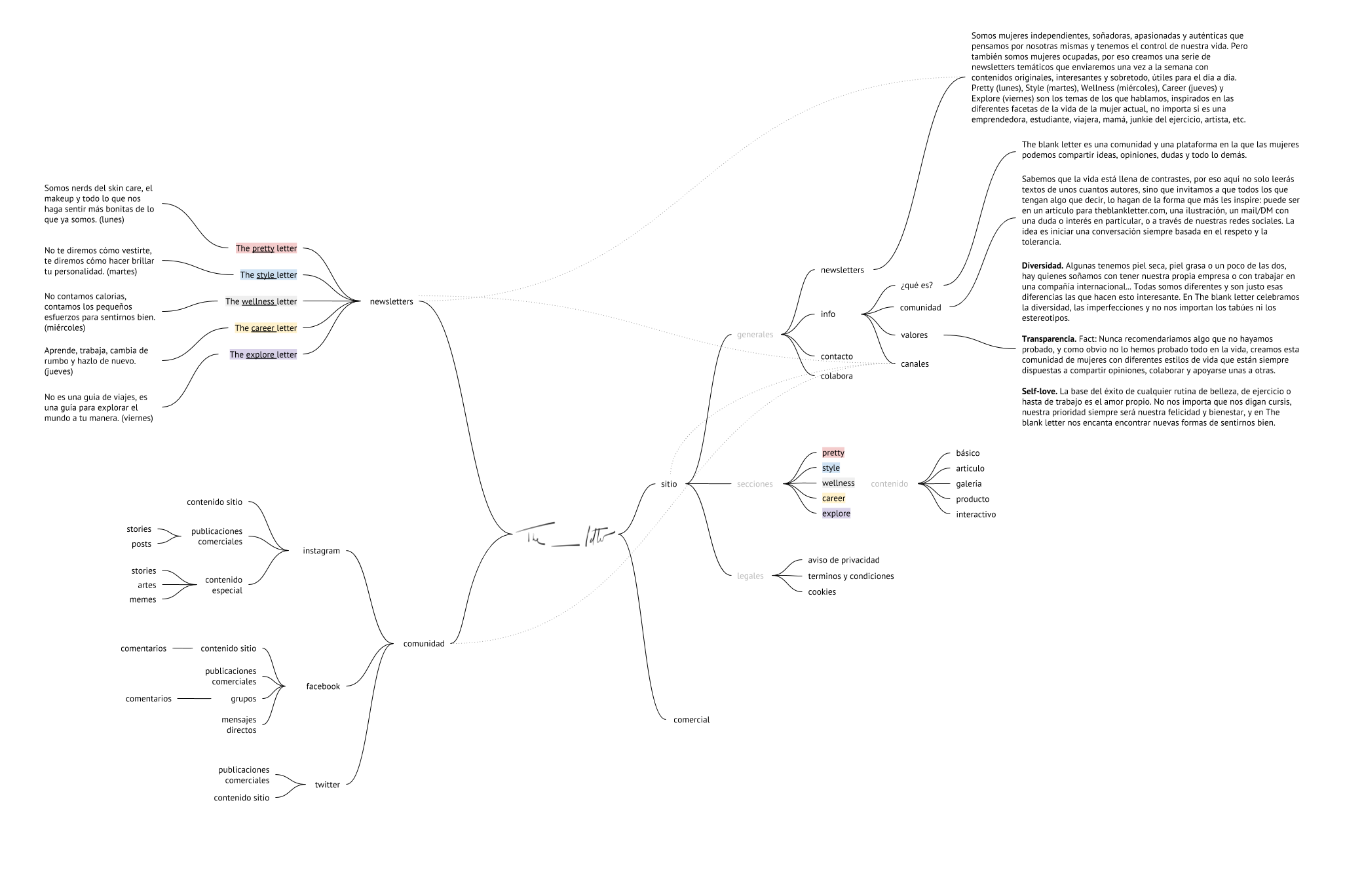 site map.
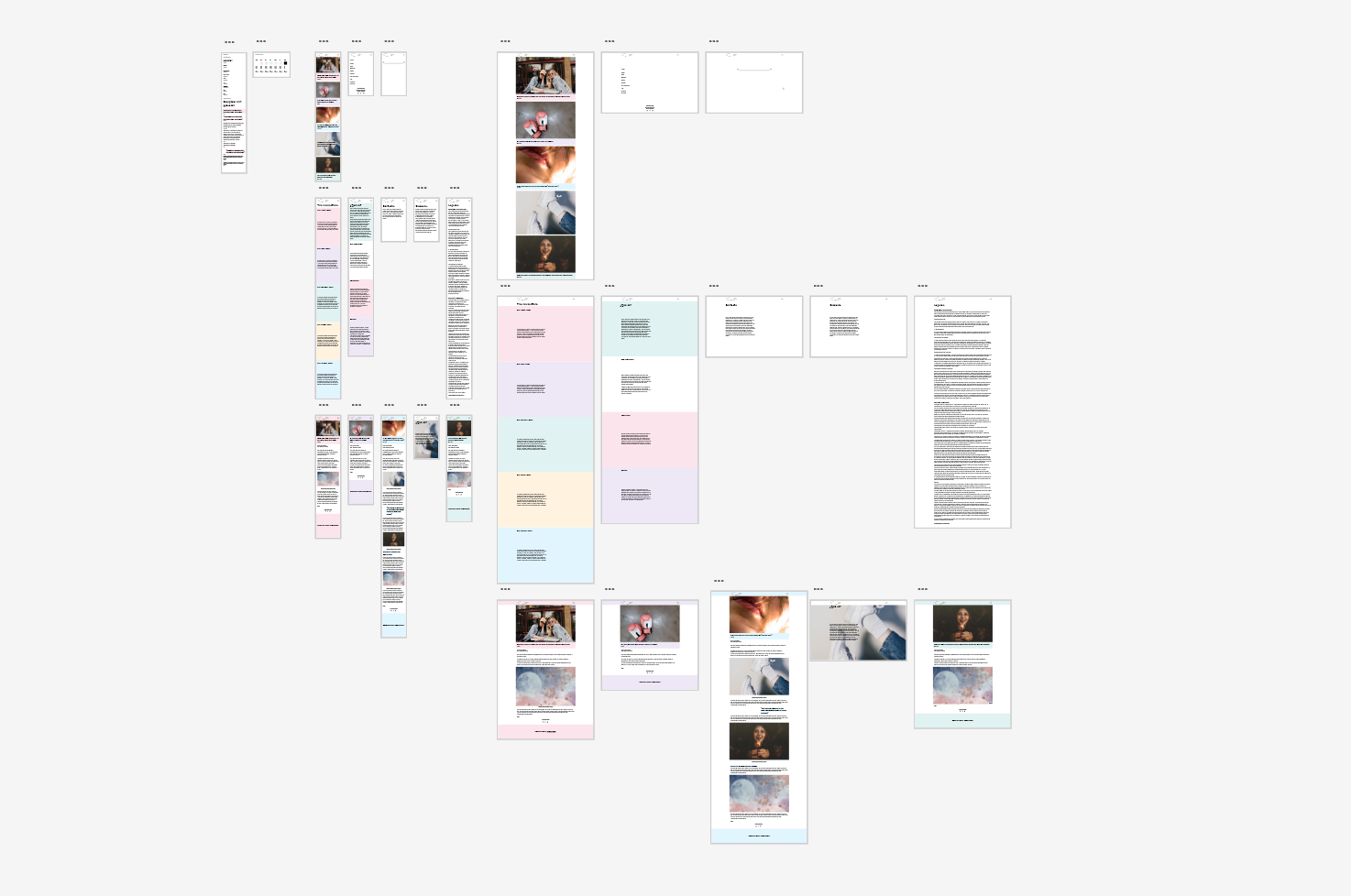 mobile and desktop wireframes.