When looking at recent digital interfaces, many styles rely, at some level, on bidimensional representations of physical components. Without being an article that pretends to describe in detail these styles, this text explores the characteristics, rationale, and representation resources of three of the most relevant recent UI styles.
Why these styles? Regarding the history of digital interfaces, there had existed several design styles and variations. In a simplified description, we have a first stage, defined mostly by technical constraints (amount of pixels, colors, and memory usage). During the second stage, the computers opened the possibilities to the designers, more intentional visual styles appeared. Two of the most relevant of this period are Skeuomorphism and Flat Design. Neumorphism isn’t a consolidated style, but I included it in this exploration for reasons I will describe below.
_
The process
After studying the defining traits of each of the styles, I created a concept interface for each one. Using a CAD tool, I built the respective 3d models that included background and appropriate lighting. Then, I made some realistic renders from the top and isometric views. Taking as reference the top view, I assembled the bidimensional representation using Figma. These components use regular patterns that can be built with code and used on final products.
Below you can find the images of this process, useful for comparing the different representations and styles.
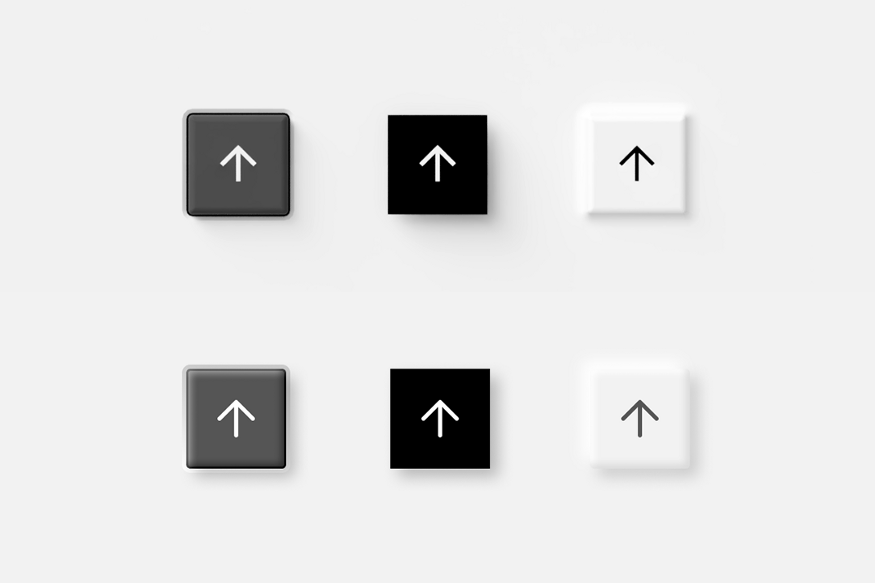 The top view render on 1st row vs the bidimensional representations on 2nd
_
Skeuomorphism
More than a demarcated style, Skeuomorphism is the rationale of emulating the physical world interfaces into the digital world. Originally this was a resource used for making the interactions more intuitive for the users. Under this principle, Skeuomorphism groups together a series of visual styles.
These visualizations show a clean style with geometric and uniform elements, coupled with slightly rounded corners. These components try to resemble a high-quality plastic interface from the physical world. The micro-interactions also replicate the physical patterns of regular buttons and controls.
You can read a more detailed description of Skeuomorphism here.
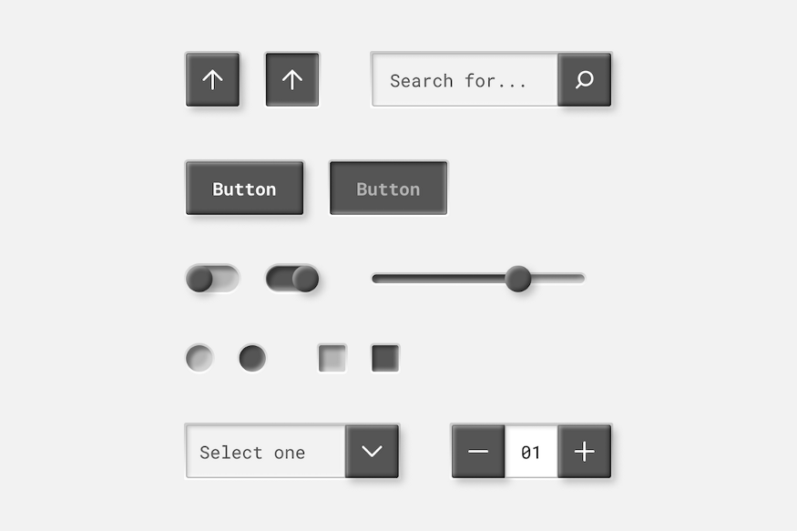 Bidimensional representation of skeuomorphic components
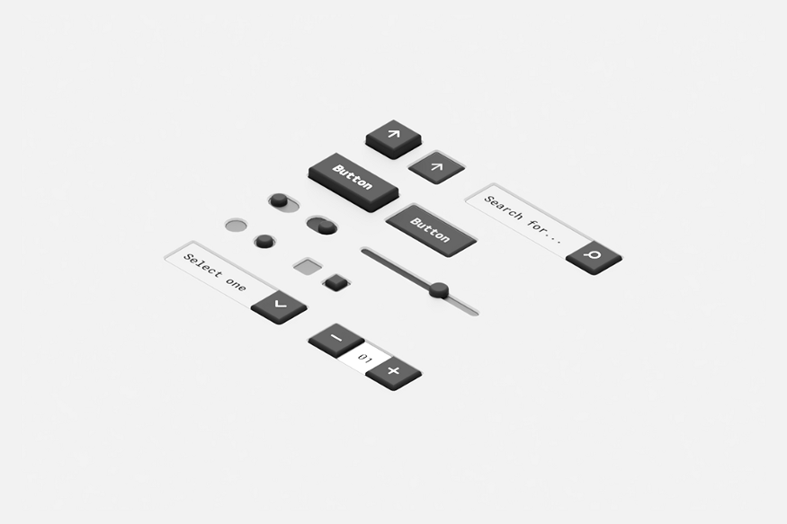 Tridimensional representation of skeuomorphic components on an isometric view
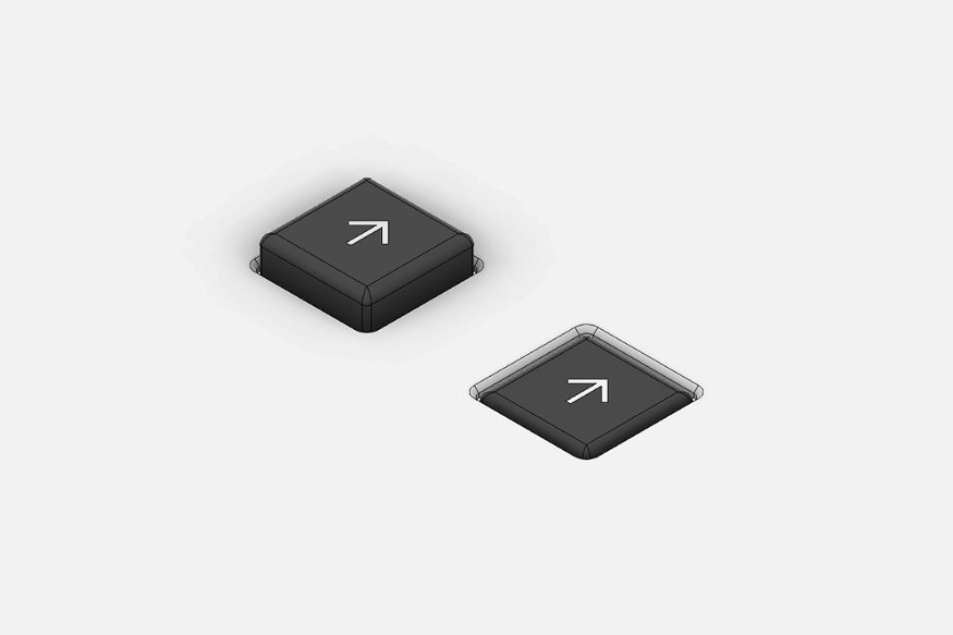 Construction details of a skeuomorphic button
_
Flat design
As an opposite response to the Skeuomorphism appeared the Flat design. When the users became familiar with the regular interaction patterns, the literality of the elements became unnecessary. The designers gave a twist to the semiotics of the components and shaped this style.
The Flat design broke with the physical rules. The reliable and realistic representations were no longer necessary. The message is conveyed through icons, abstractions, and conceptual interactions. The users were already familiar with digital-native interaction patterns.
The orthodox variations of Flat Design, exclusively rely on the bi-dimensional essence of the screen. No references to the physical world are used, such as shadows, transparencies, or reliefs.
Nevertheless, some subsequent variations of this style started to include tridimensional overlapped layers representation, expressed as shades, transparencies, and gradients. Material design is a superb example of this concept.
For this exploration, I used simple components that resemble laminated objects floating on a canvas. The micro-interactions don’t follow the roughness of materials or the gravity rules.
You can read a more detailed description of Flat Design here .
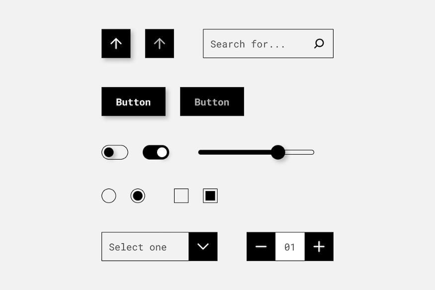 Bidimensional representation of flat components
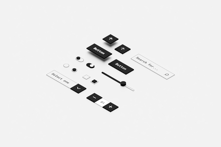 Tridimensional representation of flat components on an isometric view
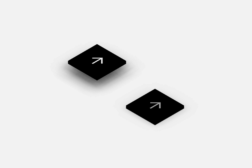 Construction details of a flat design button
_
Neumorphism
This trend isn’t a consolidated style, probably it will never be. At least, if it still preserves the visual gestures that distinguish it. The problem arises because of its evident accessibility issues. Because of this, Neumorphism has hardly ever been implemented in final products.
However, there’s something beautiful and mysterious in this style. That’s why I included it in my explorations. I think that its potential lies in the combination of physical elements with digital-native gestures. It feels like a tridimensional world exclusively created inside a digital environment. It’s like a perfect thermoformed plastic interface that doesn’t follow the physical rules. Probably, if Neumorphism could find the sufficient balance to be legible, it will consolidate as a UI style.
For the visualizations of this style, I used the current paradigms and specs of Neumorphism. These components are part of a single surface, formed by bas-reliefs and high-reliefs. The interactions are a middle ground between the two previous styles.
For a better description of Neumorphism visit this article .
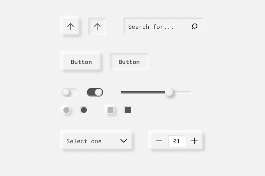 Bidimensional representation of neumorphic components
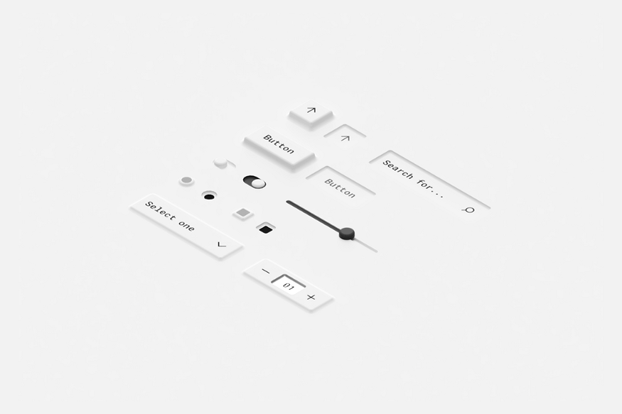 Tridimensional representation of neumorphic components on an isometric view
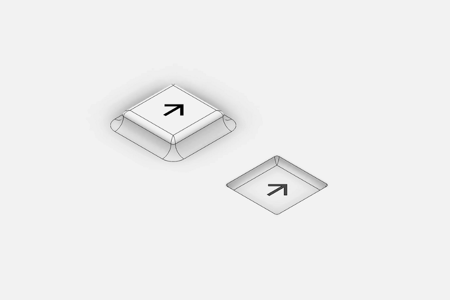 Construction details of a neumorphic button
_
Final Notes
Understanding the rationale and the geometric constraints of these styles can open the door to enhancements of the current patterns and eventually new styles or variations.
When designing a device, normally the physical and digital interfaces are articulated independently. These two worlds are subtly starting to merge in more holistic products, where the users will navigate indistinctly among the two types of interfaces. The design systems will cover the different dimensions of a product.
Imagine a design system that includes digital components, physical components, materials, colors, interactions, sounds, language, and more.
